


You work hard to drive traffic to your store, but your landing pages barely collect any email addresses. The form is there, the offer sounds “fine,” yet most visitors scroll past and disappear. Instead of guessing at random tweaks, this guide gives you a practical, checklist-driven approach to retail landing page optimization for email capture—so you can see where your pages are leaking signups and what to fix first, without rebuilding your whole site.
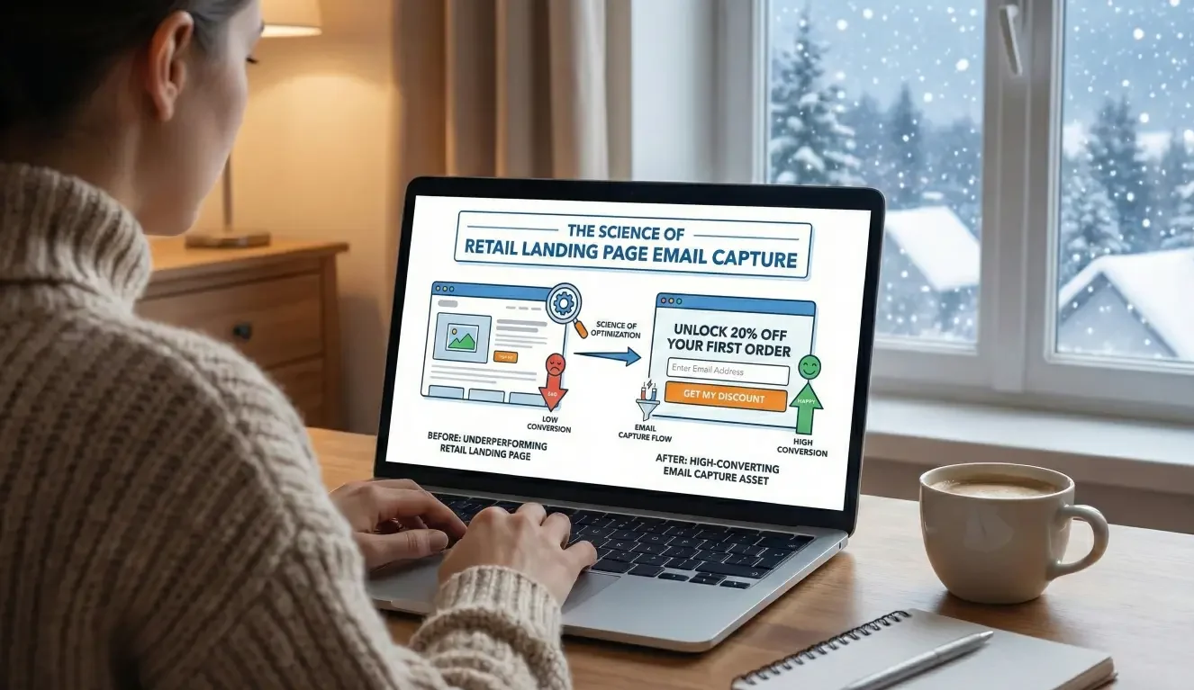
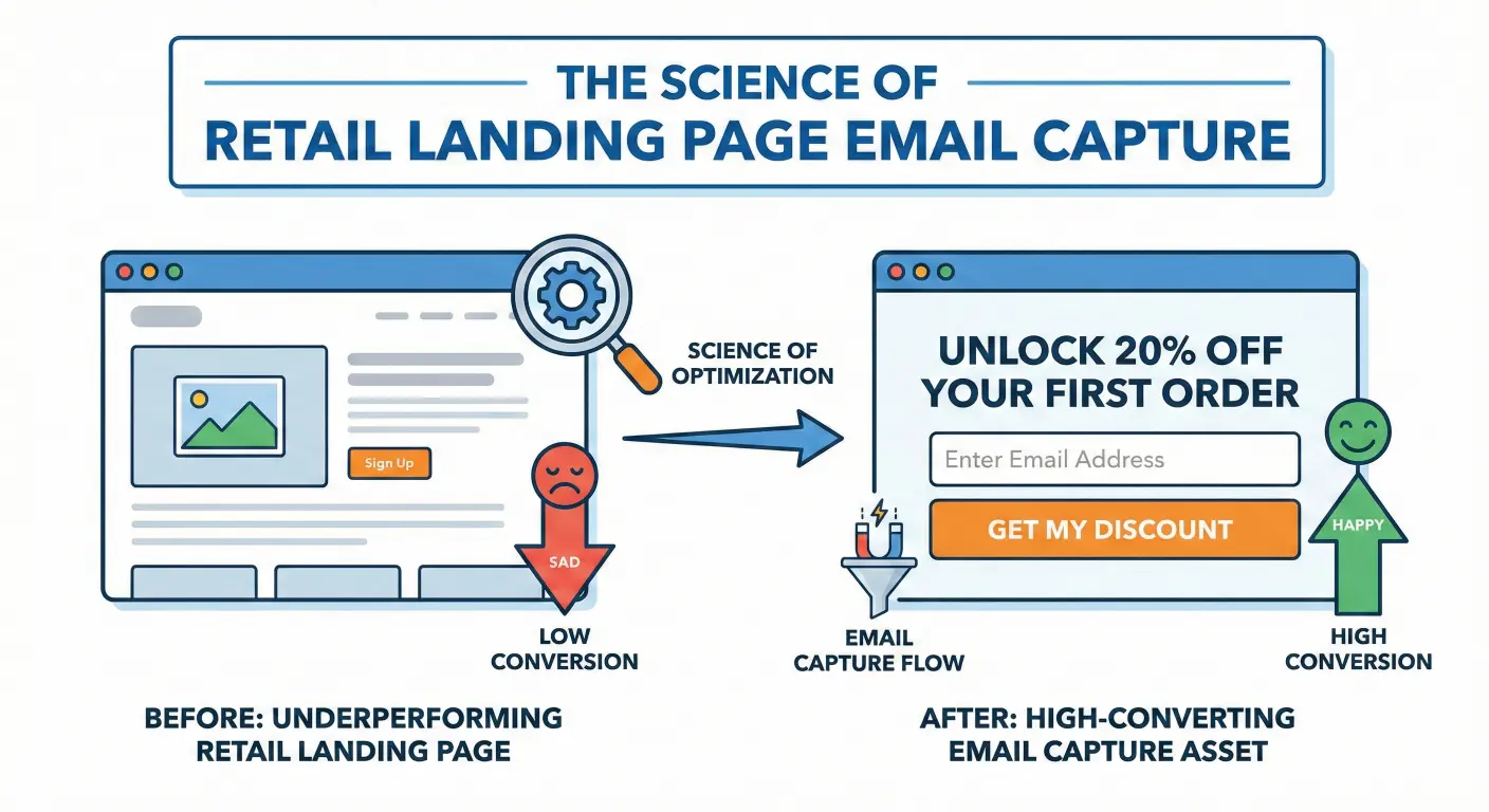
The science of Retail landing page email capture, turn underperforming retail landing pages into high-converting email capture assets.
Growing a healthy email list is one of the most controllable levers you have. Every new subscriber is a chance to follow up with a welcome series, a launch announcement, a seasonal offer, or a back-in-stock alert. When landing pages underperform, you’re not just losing “subscribes”; you’re losing future revenue that could have come from visitors who were already interested enough to click through.
This article walks through a focused set of checks—placement, incentives, messaging, and UX—that show you how to turn a “nice” opt-in form into a high-converting experience that fits your brand and your bandwidth.
Why Your Landing Pages Aren’t Capturing Enough Emails
The Real Cost of Low Email Capture in Retail & E-Commerce
If your landing pages are doing their job, traffic shouldn’t be the only metric you care about. You want a meaningful share of visitors to join your list, especially on high-intent pages:
- Category or collection pages where shoppers are browsing.
- Campaign-specific landing pages you’re sending paid traffic to.
- Content pages that attract your ideal customers.
When email capture is weak, you’re effectively running a “one-shot” store experience. A visitor comes, looks around, and leaves—often without buying or subscribing. Later, when they’re ready to purchase, they may not remember your brand, or they might search again and end up with a competitor.
Email capture doesn’t guarantee revenue, but it gives you a direct, owned channel to follow up with people who have already shown interest. If your landing pages aren’t pulling their weight, you’re paying for visibility without building a relationship.
Signs Your Landing Pages Are Underperforming (Beyond the Raw Rate)
You don’t need a complicated analytics setup to see signs of trouble. A few common patterns:
- High traffic, minimal signups: Your most visited pages barely add anyone to your list.
- Heavy discounting, little growth: You offer 10% off, 15% off—yet subscriber count stays flat.
- Great on-site engagement, flat email list: Time on page and pages per session look fine, but email signups don’t match that interest.
- Opt-in “blind spots”: Important pages (like best-selling collections or a gift guide landing page) have no clear opt-in surface at all.
If any of these sound familiar, it’s not that your audience doesn’t care about email. It’s that your landing pages aren’t making a compelling, easy, and well-timed ask.
A Quick Diagnostic Checklist for Retail Email Capture
Before you change anything, run through this checklist on one or two key landing pages:
Placement and Visibility of Your Opt-In
Ask yourself:
- Is there an opt-in that’s clearly visible without scrolling?
- Is it easy to find on mobile, not just desktop?
- Does the opt-in appear near a moment of intent—for example, after product details, near size guides, or on a campaign-specific page with a clear story?
If your form is buried in the footer or hidden behind a tiny link, it’s doing the minimum technically required—but not what you need for real capture.
Incentive and Value Proposition
Look at the offer:
- Does it say anything more specific than “Subscribe” or “Join our newsletter”?
- Does it clearly answer: “What do I actually get if I sign up?”
- Does the incentive match the context of the page? For example, a “Get first access to our next drop” offer on a new collection landing page.
If the value feels generic or disconnected from what the visitor is doing in that moment, they’ll assume the emails will be generic too.
Messaging, Microcopy, and Social Proof
Review the text around your form:
- Is the headline clear, benefit-focused, and easy to read quickly?
- Does supporting copy hint at the type of content you send—new arrivals, styling ideas, service reminders, early access, or exclusive offers?
- Do you use any social proof, like “Join 5,000+ customers,” or a short quote from a happy subscriber, where appropriate?
Small tweaks in microcopy can make the difference between “Why bother?” and “Okay, this feels worth it.”
Form Fields, UX, and Friction
Finally, the mechanics:
- Are you asking for only what you truly need to start the relationship (usually email, maybe first name)?
- Is the form fast and responsive, or does it lag on mobile?
- Are error messages clear and helpful if someone mistypes their email?
- Do popups interrupt key actions like adding to cart, or are they introduced at more natural moments?
If completing the form feels like a chore—or gets in the way of the main goal of the page—many visitors will bail.
Optimizing Placement: Putting Opt-Ins Where Intent Is Highest
Matching Opt-In Locations to Page Types
Different landing pages play different roles; your opt-in strategy should reflect that.
- Home and hero sections: A soft, value-driven opt-in can live near the top for visitors who are just getting oriented.
- Collection and category pages: Consider inline opt-ins tied to specific interests, like “Get early access to drops in [Category].”
- Product pages: A subtle opt-in below the main information can appeal to visitors not ready to buy now but interested in hearing about restocks, size expansions, or similar items.
- Content and campaign landing pages: If you run guides, lookbooks, or “style your space” content, an opt-in that offers related tips or behind-the-scenes access can feel very natural.
Even auto dealers with offer-specific landing pages can apply the same logic: after explaining an offer, an opt-in to receive updates on similar specials can capture interest without forcing a decision on the spot.
Timed vs Behavior-Based Prompts
Not every visitor should see a popup at the same time.
- Entry popups: These can work for some brands, but they risk interrupting before the visitor understands why they should care.
- Scroll-triggered prompts: Show a modal or slide-in after a visitor has engaged with a certain portion of the page—say, 50–75% scroll.
- Exit-intent prompts: Offer one more chance to subscribe when a desktop visitor’s cursor moves toward closing the tab or navigating away.
- Click-triggered modals: Use a clear link or button (“Get 10% off your first order”) that opens a focused opt-in experience for visitors who are already interested.
Behavior-based prompts often feel more earned; they’re responding to what the visitor is actually doing on the page.
Mobile-First Considerations for Placement
On mobile, screen real estate is tight and attention is fragile. When optimizing for mobile:
- Avoid full-screen popups that appear immediately and block key content.
- Use slide-ins at the bottom or top that don’t fully cover the view and can be dismissed easily.
- Ensure forms are tap-friendly: large fields, clear buttons, and no tiny close icons.
- Double-check that any fixed bars or modals don’t hide important navigation or “Add to cart” buttons.
A landing page can look beautiful on desktop and still be frustrating on a phone. Since much retail traffic is mobile, this is often where email capture quietly breaks.
Crafting Incentives That Reflect Real Customer Value
Beyond the Generic Discount Code
Discounts are common, but they’re not your only option—and over time, they can train customers to wait for a deal.
Consider incentives such as:
- Early access: “Get first access to our next drop / restock / seasonal collection.”
- Exclusive content: Styling guides, how-to content, or recipes that are genuinely useful.
- Loyalty perks: Points, birthday rewards, or members-only freebies.
- Category-specific value: “Be the first to know about new arrivals in [Category]” or “Get alerts when [Size/Color] returns.”
The more closely the incentive matches the visitor’s interest on that specific landing page, the stronger the motivation to opt in.
Aligning Incentives with Margins and Brand Positioning
Whatever you offer should make sense for your margins and your brand:
- Premium or luxury brands might emphasize exclusivity and insider access over percentage discounts.
- Value-driven brands may lean more on promotions but still benefit from caps and rules that keep offers sustainable.
- Subscription products might use “extra month” or “members-only add-ons” rather than big upfront discounts.
The goal is to create a compelling reason to subscribe that also supports long-term profitability.
Testing Simple Variations Without Rebuilding the Page
You don’t have to redesign everything at once. Start with low-effort tests:
- Rewriting the headline and subhead around a more specific benefit.
- Changing the way you frame a discount (e.g., value-focused vs. percentage-focused).
- Highlighting urgency in a fair way (limited-time seasonal offer, a specific launch date).
- Matching the incentive more closely to the campaign the landing page is built around.
Small variations can reveal what resonates with your audience, without needing a full design sprint.
Messaging and Microcopy That Make Opt-Ins Feel Worth It
Clear, Benefit-Driven Headlines
Your headline should answer, “Why should I join?” in a split second.
Compare:
- “Subscribe to our newsletter”
vs. - “Get early access to new drops and VIP-only offers”
The second example gives the visitor a reason to care. Tailor headlines to the context of the landing page: if the page is about a specific product line or theme, reflect that in the opt-in.
Setting Expectations on Frequency and Content
One of the biggest anxieties around email signups is fear of spam.
Reassure visitors by:
- Calling out what they’ll actually receive (e.g., “1–2 emails a week with new arrivals and styling tips”).
- Promising no unnecessary noise (and honoring that promise).
- Letting them know they can opt out at any time.
When expectations are clear, people are more likely to opt in—and less likely to unsubscribe out of frustration later.
Using Social Proof and Brand Voice to Build Trust
Where appropriate, add light social proof:
- “Join 4,000+ subscribers who get first access to our drops.”
- A short quote from a customer who loves your emails.
- A subtle nod to how your community uses the list (e.g., “Our subscribers are the first to know when we restock best-sellers.”)
Keep it concise and on-brand. You don’t need a full testimonial section—just a hint that real people find value in being on your list.
UX Details That Quietly Kill (or Boost) Signup Conversion
Form Length, Error States, and Validation
Friction often hides in the details:
- Limit fields to what you genuinely use for segmentation or personalization at the start. You can always ask for more later.
- Make error messages specific (“Please enter a valid email address”) rather than generic.
- Use inline validation where practical so visitors can fix mistakes quickly.
If your form feels light and forgiving instead of finicky, more people will complete it.
Page Speed, Layout, and Distractions
Slow or cluttered pages can undermine even the best opt-in.
- Check whether tracking scripts, heavy images, or third-party widgets are slowing down the landing page.
- Avoid stacking multiple competing CTAs around your email form; give the opt-in a bit of breathing room.
- Make sure the form layout looks clean on both large and small screens.
A smoother experience doesn’t just help email capture—it supports your overall conversion goals.
Accessibility and Inclusivity Basics
Accessible forms expand your potential subscriber base and make your site more usable for everyone:
- Ensure sufficient color contrast between text and background.
- Use clear labels, not just placeholder text, for form fields.
- Make the form navigable via keyboard and friendly to screen readers.
- Keep language straightforward and free of unnecessary jargon.
These changes can help more people complete the form comfortably.
Measuring and Iterating: Turning “Poor Performance” into a Clear Plan
What to Track Beyond Raw Signup Rate
Yes, your overall signup rate matters—but context matters too. Track:
- By device: Are mobile visitors signing up less often than desktop visitors?
- By page type: Do campaign landing pages convert better than generic pages?
- By source: Are visitors from certain channels (e.g., social ads) more or less likely to subscribe?
These patterns help you prioritize where to focus your optimization efforts.
Simple A/B Tests for Busy E-Commerce Teams
You don’t need to run complex experiments. Start with:
- Headline tests: Specific benefit vs. generic framing.
- Incentive framing tests: Different value propositions for the same underlying offer.
- Placement tests: Above-the-fold form vs. mid-page, or different types of prompts (scroll-triggered vs. exit-intent).
Test one meaningful change at a time so you know what’s actually driving the difference.
When to Bring in Automation and Visitor-Driven Tools
Improving your email capture is step one. Step two is making sure those new subscribers receive thoughtful, timely follow-up.
Visitor-driven tools can help you:
- Trigger welcome series based on what page or offer someone signed up from.
- Tailor early emails around categories or interests they’ve already engaged with.
- In some cases, add direct mail touchpoints for high-value segments who’ve opted in.
That way, each new subscriber is more likely to move from “email address” to “engaged customer” over time.
How MailX2 Fits into a Better Email Capture System
From Captured Email to Automated Follow-Up
Once your landing pages are set up for stronger email capture, the next challenge is consistency. It’s one thing to collect addresses; it’s another to send the right messages at the right time.
Platforms like MailX2 are designed to:
- Connect opt-in forms and visitor behavior to automated email sequences.
- Help you welcome new subscribers with context-aware messages based on where they signed up.
- Optionally introduce direct mail touches for segments where a tangible piece makes sense.
You still own the brand story and offers; the system helps ensure that every new signup is greeted and nurtured without you having to manage every send manually.
Supporting Founders with Managed Setup and Execution
Not every founder has time to architect flows, design emails, and monitor performance. That’s where managed support can matter:
- Help mapping your key landing pages and opt-ins to appropriate sequences.
- Guidance on messaging that feels true to your brand and your customers.
- Ongoing adjustments as you run new campaigns or launch new products.
The goal isn’t just more automation; it’s a setup you understand and can sustain.
A Landing Page Checklist You Can Actually Use
If your landing pages are driving traffic but not email signups, it’s rarely one single issue. More often, it’s a combination of low-visibility forms, generic incentives, vague messaging, and quiet UX friction that slows people down.
By working through a simple checklist—placement and visibility, incentive and value, messaging and microcopy, form UX, and basic measurement—you can start turning “nice forms” into high-converting opt-ins. You don’t need to redesign everything at once. Small, focused changes can gradually improve your signup conversion and make your overall retail landing page optimization feel manageable.
Once you’ve strengthened your opt-ins, connecting them to visitor-driven email (and, when it fits, direct mail) gives every new subscriber a better chance of becoming a loyal customer over time.
If you’d like a partner in that process, you can invite someone to review your key landing pages, your email capture setup, and your follow-up flows—and help you turn scattered ideas into a practical plan you can actually run.
FAQ content
- Why is my retail landing page collecting so few email signups?
Often, low email capture comes down to a mix of issues: the opt-in is hard to spot, the offer is generic, the copy doesn’t clearly state the benefit, or the form feels like extra work—especially on mobile. If visitors don’t see a clear reason to join or find it inconvenient, most will simply continue browsing or leave without subscribing. - Where should I place opt-in forms on my e-commerce landing pages to improve signup rates?
Place opt-ins where intent is highest: near the top of key pages for a soft invite, within collection or product sections where interest is already clear, and on campaign-specific landing pages that tell a focused story. Behavior-based prompts—like scroll-triggered or exit-intent modals—can add another chance to subscribe without interrupting visitors the moment they arrive. - What kind of incentive works best for email capture on retail landing pages?
The best incentives feel relevant and sustainable. That might be early access to new drops, members-only perks, category-specific alerts, or carefully framed discounts. Align the incentive with what visitors care about on that particular page and with your brand’s margins and positioning so you’re not over-discounting just to grow your list. - How can I improve my email signup form UX without redesigning my entire landing page?
Start small: reduce the number of fields to what you truly need, make error messages clear, ensure the form looks clean on mobile, and avoid popups that block key actions. Adjust button copy to be straightforward and inviting, and check that the form loads quickly and responds smoothly. - What metrics should I track to know if my landing page email capture is improving?
Track overall signup rate, but also break it down by device (mobile vs. desktop), page type, and main traffic sources. Look at whether changes to headlines, incentives, or placement correlate with meaningful shifts in signups, and pay attention to the downstream behavior of new subscribers—such as opens, clicks, or eventual purchases over time. - How does automation help me get more value from the emails I capture on my landing pages?
Automation helps you respond consistently and contextually. When someone signs up, they can automatically enter a welcome series tailored to the page or offer they responded to, receive timely follow-ups, and, in some cases, be eligible for coordinated direct mail touches. This reduces manual workload and gives each new subscriber a more structured path from “just joined” to “engaged customer.”
If your landing pages are driving traffic but not email signups, you don’t have to guess which changes will matter most.
Book a landing page and email capture strategy call with MailX2.
We’ll walk through your key pages, opt-in experience, and follow-up, then outline a practical plan to improve capture and connect new subscribers to visitor-driven email (and, if it fits, direct mail) campaigns you can actually maintain.